|
11/3/2016 1 Comment November 03rd, 2016In art we were given a page of words and we had the make a poem or another sentence and highlight them on the outside. I used complementary colors to make it look good. Such as blue-orange,green/red,purple/yellow. The one in the blue is "separation is developed between artists and evil revealing a ultimate step to value people's territory. this is my favorite because when someone is kidnapped or taken they are hurt their values and the families values cause some are ashamed that their kid gets kidnapped and don't care about the child. They care about what their values look like and what they look like it is depressing. Don't care about youlike care about the child. 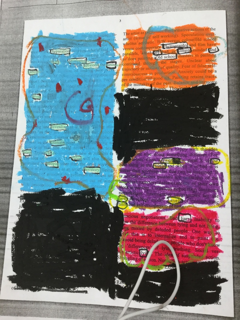
1 Comment
Molly
11/4/2016 04:10:48 pm
I like how you did different colors to represent different patterns and colors in your black out piece. Leave a Reply. |
AuthorI'm Carlie and I like art and music. Archives
January 2017
Categories |
 RSS Feed
